Components
Introduction
There are a number of different components you can add in when building a page. They allow you to add images, videos, highlight important links and help split the page up so the user can navigate the content more easily.
Some components we use often, for example the Manual Block of Cards and the Featured Link, while others have a very specific purpose and are used much less often, for example Database Detail Cards.
Components need to be inserted onto a page in Experience Editor view. They cannot be added in Content Editor view. They must also be published separately to the page.
Read on below for more details about each of the components and when to use them.
-
Adding components
How to add and move components on a page -
Creating components
How to create components
Components
Accordions
Guidance on using the Accordion component which displays content in expandable drop down sections.
Copy Section
Guidance on using the Copy Section component which is used for adding sections of text to a page.
CTA Bar
How to use the CTA bar component to create a prominent Call To Action at the top of a page.
Curated Tabs
How to use the Curated Tabs component together with the Curated Tabs template.
Database Detail Cards
More about Database Detail Cards and when to use them.
Featured Link
This common component is useful for highlighting an internal link and also works well on landing pages.
Image Copy Section
We use the Image Copy Section component for introductions and for longer sections of text accompanied by a large image.
Image Gallery
When to add the Image Gallery component to a page and how to use it.
Large Quote
More about the Large Quote component and its features.
Location Map
Guidance on using the Location Map component.
Manual Block of Cards
How to use the Manual Block of Cards component.
Multi Column Links
How to use the Multi Column Links component.
Partner Logo Strip
How to use the Partner Logo Strip component.
Service Detail Cards
Using the Service Detail Cards to build new landing pages.
Single Media Content
Guidance on using the Single Media Content component.
Single Media Section
Guidance on using the Single Media Section component.
Small Image Copy Section
Guidance on using the Small Image Copy Section component.

Stat Section
How to use the Stat Section component.
Tabbed Content
Guidance on using the Tabbed Content component.
Two Column Text
Guidance on using the Two Column Text component.
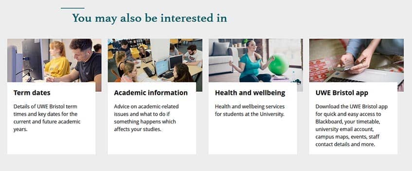
You May Also Be Interested In
Guidance on using the You May Also Be Interested In component which displays internal links as cards with images.