Featured link
Display a clear call-to-action on a page with a bold strip of colour and a wide image.
Featured Link example


When to use a featured link
A featured link component can be used to highlight an important call-to-action (CTA) on a page. This component has a wide image (optional) and block colour background which is useful when wanting to make content stand out from other content on a page.
Key features and behaviour
There are multiple rendering options for a featured link component that change how it displays on the page. For example, you can change:
- the background colour (teal or purple)
- alignment of the image (left or right)
- whether the image displays or not.
These rendering options can be accessed through Experience Editor.
Please note some rendering options are exclusively for the Skilled webpages and are not available for use across the rest of the website.
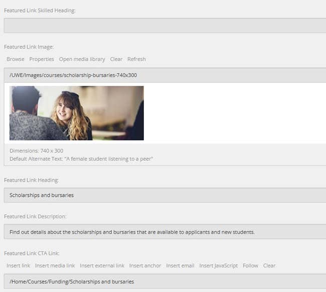
How to create a featured link
Complete the Featured Link heading, description and CTA link fields within Content Editor. Note: the description field is plain text therefore no additional formatting or links can be applied.
Image dimensions
If you wish to use an image with this component, you will need upload the image to the Media Library in the correct dimensions. This image will need to be landscape.
|
Image dimensions |
740px by 300px |
Recommended word count
Featured Links have a limited amount of space for text and should be a maximum of one or two sentences.
|
Header |
8-45 characters (with spaces) |
|
Body text |
15-40 words |
Notes on component usage
- If you are linking to an internal page, use the page title (for the title and CTA button) and page thumbnail within the featured link for consistency and to make it more accessible.
- Some field/rendering options are exclusively for the Skilled webpages and not available for use across the rest of the website.