Accordions
A menu of expandable items that allows the user to easily browse, show and hide information.
Accordion example


When to use an accordion component
An accordion component presents as a menu of expandable items that allows the user to easily browse, show and hide information that's relevant to them. Accordion components are useful to display long form text on a page in a concise and logical way.
Key features and behaviours
- Accordions have an optional header and description. If left blank, you must select the 'remove padding' option in the rendering options in Experience Editor.
- Accordions should not be used for top level information. Accordions are suitable for finer details or information that may not apply to all users.
- Accordions are also not suitable for rich media content such as images or videos.
How to use an accordion component
- Make the main accordion component that will act as the containing folder for the accordion items. Name the accordion using the same naming convention as pages.
- Create the individual accordion items by right-clicking the accordion component and selecting 'insert > accordion item'. Give the accordion item an appropriate name, usually the heading that you plan to use for it.
Notes on component usage
- Each accordion item is assigned a H3 heading tag – therefore any headings used inside an accordion item should start at H4.
- You can drag and drop accordion items to reorder them using Content Editor.
-
Remember to submit both the accordion component and individual accordion items.
Creating anchors for accordion items
Accordion items automatically generate an ID that can be used as an anchor link to direct users to the accordion item.
The ID can be found at the end of the URL when an accordion item is opened, for example:
Accordion item ID: #a18dc85b5-2f52-430e-aa0a-b58c34d29c80
Customising accordion anchor links
The ID given to an accordion item can be customised to make the URL more meaningful to a user. For example, the above accordion item ID could be renamed #clearing.
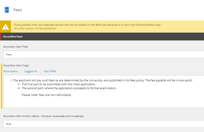
Use the 'accordion item anchor name' field to enter a short but descriptive label which will be your new anchor. This name should be:
- as short as possible
- all lowercase
- have no special characters
- no spaces (use hyphens instead of spaces)
- unique to other anchors on the page
Unpublishing and repurposing accordion items
Accordion items should not be repurposed if the content on a page changes.
If you do not need an accordion item anymore, you should unpublish it in the normal way.
For any new content, you should create an entirely new accordion item so that a new anchor link is generated.