Tabbed Content
How to use the Tabbed Content Section together with Tabbed Content
When and how to use Tabbed Content
- You can use Tabbed Content to display up to four tabs (or less). Each tab needs a small image and a heading in order for it to work correctly.
- One tab displays content at a time and, by default, the left-hand tab is open but users can click on the headings of the other tabs to display that content.
- You can change the heading colour to teal or purple in the display settings.
- This is a more complex component as you need to create separate Tabbed Content Section and Tabbed Content components. The Tabbed Content Section item then pulls through tabs created in the Tabbed Content component section.
- It is possible to add body text in as two columns. If you use this feature, make sure to also add in some text for the 'Tabbed Content Copy' section, otherwise the two columns will not display correctly.
Tabbed Content example


Adding Tabbed Content
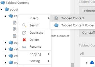
Create a Tabbed Content folder within the Tabbed Content component folder.

Right click on your Tabbed Content folder and go to Insert > Tabbed Content.
You will need to a Tabbed Content item for every tab you want to add (up to a maximum of four).


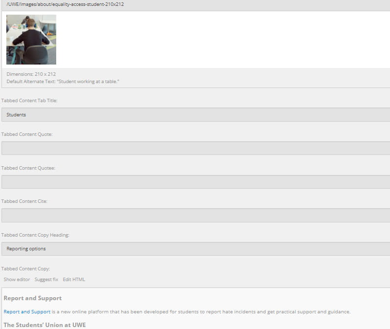
- Upload an image cropped to 210x212 for the thumbnail.
- Give your tab a title in the Tabbed Content Tab Title field. You can add an optional heading in the Tabbed Content Copy Heading that is displayed when the tab is open.
- You can have your copy in one text block (Tabbed Content Copy) or two columns. If you want your text in columns, add your content to Tabbed Content Column One Copy and Tabbed Content Column Two Copy.
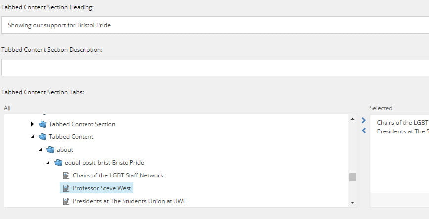
The Tabbed Content Section item pulls through tabs created in the Tabbed Content component section.

- In the 'Tabbed Content Section Tabs' column, navigate to Components > Tabbed Content and open the folder where you saved your tabs.
- Highlight the tabs you want to add and press the arrow to the right. Tabs can be removed from the 'Selected' folder by highlighting them and pressing the arrow to the left.
